- All Implemented Interfaces:
Styleable,EventTarget,Skinnable
public class ColorPicker
extends ComboBoxBase<Color>
ColorPicker control allows the user to select a color from either a standard palette of colors with a simple one click selection OR define their own custom color.
The value is the currently selected Color.
An initial color can be set by calling setColor or via the constructor. If nothing
is specified, a default initial color is used.
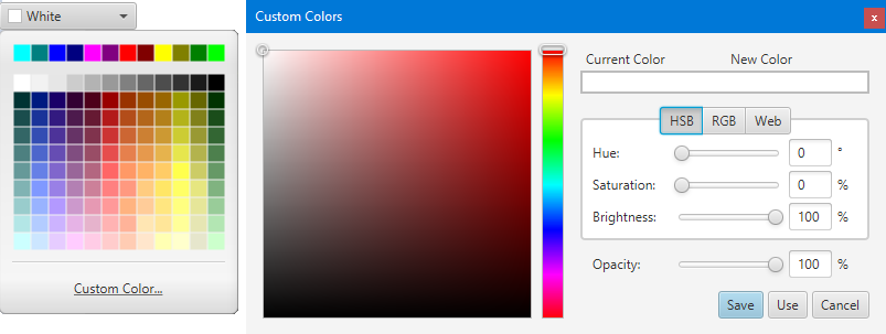
The ColorPicker control provides a color palette with a predefined set of colors. If the user does not want to choose from the predefined set, they can create a custom color by interacting with a custom color dialog. This dialog provides RGB, HSB and Web modes of interaction, to create new colors. It also lets the opacity of the color to be modified.
Once a new color is defined, users can choose whether they want to save it
or just use it. If the new color is saved, this color will then appear in the
custom colors area on the color palette. Also getCustomColors
returns the list of saved custom colors.
The promptText is not supported and hence is a no-op.
But it may be supported in the future.
 ColorPicker colorPicker = new ColorPicker();
 colorPicker.setOnAction(e -> {
     Color c = colorPicker.getValue();
     System.out.println("New Color's RGB = "+c.getRed()+" "+c.getGreen()+" "+c.getBlue());
 });
The ColorPicker control's appearance can be styled in three ways: a simple Button mode,
MenuButton mode or SplitMenuButton mode. The default is MenuButton mode.
For a Button like appearance the style class to use is STYLE_CLASS_BUTTON
and for SplitMenuButton appearance and behavior, the style class to use is
STYLE_CLASS_SPLIT_BUTTON.
colorPicker.getStyleClass().add("button");
or
colorPicker.getStyleClass().add("split-button");- Since:
- JavaFX 2.2
-
Property Summary
Properties inherited from class javafx.scene.control.ComboBoxBase
armed, editable, onAction, onHidden, onHiding, onShowing, onShown, promptText, showing, valueProperties inherited from class javafx.scene.control.Control
contextMenu, skin, tooltipProperties inherited from class javafx.scene.layout.Region
background, border, cacheShape, centerShape, height, insets, maxHeight, maxWidth, minHeight, minWidth, opaqueInsets, padding, prefHeight, prefWidth, scaleShape, shape, snapToPixel, widthProperties inherited from class javafx.scene.Parent
needsLayoutProperties inherited from class javafx.scene.Node
accessibleHelp, accessibleRoleDescription, accessibleRole, accessibleText, blendMode, boundsInLocal, boundsInParent, cacheHint, cache, clip, cursor, depthTest, disabled, disable, effectiveNodeOrientation, effect, eventDispatcher, focused, focusTraversable, hover, id, inputMethodRequests, layoutBounds, layoutX, layoutY, localToParentTransform, localToSceneTransform, managed, mouseTransparent, nodeOrientation, onContextMenuRequested, onDragDetected, onDragDone, onDragDropped, onDragEntered, onDragExited, onDragOver, onInputMethodTextChanged, onKeyPressed, onKeyReleased, onKeyTyped, onMouseClicked, onMouseDragEntered, onMouseDragExited, onMouseDragged, onMouseDragOver, onMouseDragReleased, onMouseEntered, onMouseExited, onMouseMoved, onMousePressed, onMouseReleased, onRotate, onRotationFinished, onRotationStarted, onScrollFinished, onScroll, onScrollStarted, onSwipeDown, onSwipeLeft, onSwipeRight, onSwipeUp, onTouchMoved, onTouchPressed, onTouchReleased, onTouchStationary, onZoomFinished, onZoom, onZoomStarted, opacity, parent, pickOnBounds, pressed, rotate, rotationAxis, scaleX, scaleY, scaleZ, scene, style, translateX, translateY, translateZ, viewOrder, visible -
Field Summary
Fields Modifier and Type Field Description static StringSTYLE_CLASS_BUTTONThe style class to specify a Button like appearance of ColorPicker control.static StringSTYLE_CLASS_SPLIT_BUTTONThe style class to specify a SplitMenuButton like appearance of ColorPicker control.Fields inherited from class javafx.scene.control.ComboBoxBase
ON_HIDDEN, ON_HIDING, ON_SHOWING, ON_SHOWNFields inherited from class javafx.scene.layout.Region
USE_COMPUTED_SIZE, USE_PREF_SIZEFields inherited from class javafx.scene.Node
BASELINE_OFFSET_SAME_AS_HEIGHT -
Constructor Summary
Constructors Constructor Description ColorPicker()Creates a default ColorPicker instance with a selected color set to white.ColorPicker(Color color)Creates a ColorPicker instance and sets the selected color to the given color. -
Method Summary
Modifier and Type Method Description protected Skin<?>createDefaultSkin()Create a new instance of the default skin for this control.ObservableList<Color>getCustomColors()Gets the list of custom colors added to the Color Palette by the user.Methods inherited from class javafx.scene.control.ComboBoxBase
arm, armedProperty, disarm, editableProperty, executeAccessibleAction, getOnAction, getOnHidden, getOnHiding, getOnShowing, getOnShown, getPromptText, getValue, hide, isArmed, isEditable, isShowing, onActionProperty, onHiddenProperty, onHidingProperty, onShowingProperty, onShownProperty, promptTextProperty, queryAccessibleAttribute, setEditable, setOnAction, setOnHidden, setOnHiding, setOnShowing, setOnShown, setPromptText, setValue, show, showingProperty, valuePropertyMethods inherited from class javafx.scene.control.Control
computeMaxHeight, computeMaxWidth, computeMinHeight, computeMinWidth, computePrefHeight, computePrefWidth, contextMenuProperty, getBaselineOffset, getClassCssMetaData, getContextMenu, getControlCssMetaData, getCssMetaData, getInitialFocusTraversable, getSkin, getTooltip, isResizable, layoutChildren, setContextMenu, setSkin, setTooltip, skinProperty, tooltipPropertyMethods inherited from class javafx.scene.layout.Region
backgroundProperty, borderProperty, cacheShapeProperty, centerShapeProperty, getBackground, getBorder, getHeight, getInsets, getMaxHeight, getMaxWidth, getMinHeight, getMinWidth, getOpaqueInsets, getPadding, getPrefHeight, getPrefWidth, getShape, getUserAgentStylesheet, getWidth, heightProperty, insetsProperty, isCacheShape, isCenterShape, isScaleShape, isSnapToPixel, layoutInArea, layoutInArea, layoutInArea, layoutInArea, maxHeight, maxHeightProperty, maxWidth, maxWidthProperty, minHeight, minHeightProperty, minWidth, minWidthProperty, opaqueInsetsProperty, paddingProperty, positionInArea, positionInArea, prefHeight, prefHeightProperty, prefWidth, prefWidthProperty, resize, scaleShapeProperty, setBackground, setBorder, setCacheShape, setCenterShape, setHeight, setMaxHeight, setMaxSize, setMaxWidth, setMinHeight, setMinSize, setMinWidth, setOpaqueInsets, setPadding, setPrefHeight, setPrefSize, setPrefWidth, setScaleShape, setShape, setSnapToPixel, setWidth, shapeProperty, snappedBottomInset, snappedLeftInset, snappedRightInset, snappedTopInset, snapPosition, snapPositionX, snapPositionY, snapSize, snapSizeX, snapSizeY, snapSpace, snapSpaceX, snapSpaceY, snapToPixelProperty, widthPropertyMethods inherited from class javafx.scene.Parent
getChildren, getChildrenUnmodifiable, getManagedChildren, getStylesheets, isNeedsLayout, layout, lookup, needsLayoutProperty, requestLayout, requestParentLayout, setNeedsLayout, updateBoundsMethods inherited from class javafx.scene.Node
accessibleHelpProperty, accessibleRoleDescriptionProperty, accessibleRoleProperty, accessibleTextProperty, addEventFilter, addEventHandler, applyCss, autosize, blendModeProperty, boundsInLocalProperty, boundsInParentProperty, buildEventDispatchChain, cacheHintProperty, cacheProperty, clipProperty, computeAreaInScreen, contains, contains, cursorProperty, depthTestProperty, disabledProperty, disableProperty, effectiveNodeOrientationProperty, effectProperty, eventDispatcherProperty, fireEvent, focusedProperty, focusTraversableProperty, getAccessibleHelp, getAccessibleRole, getAccessibleRoleDescription, getAccessibleText, getBlendMode, getBoundsInLocal, getBoundsInParent, getCacheHint, getClip, getContentBias, getCursor, getDepthTest, getEffect, getEffectiveNodeOrientation, getEventDispatcher, getId, getInitialCursor, getInputMethodRequests, getLayoutBounds, getLayoutX, getLayoutY, getLocalToParentTransform, getLocalToSceneTransform, getNodeOrientation, getOnContextMenuRequested, getOnDragDetected, getOnDragDone, getOnDragDropped, getOnDragEntered, getOnDragExited, getOnDragOver, getOnInputMethodTextChanged, getOnKeyPressed, getOnKeyReleased, getOnKeyTyped, getOnMouseClicked, getOnMouseDragEntered, getOnMouseDragExited, getOnMouseDragged, getOnMouseDragOver, getOnMouseDragReleased, getOnMouseEntered, getOnMouseExited, getOnMouseMoved, getOnMousePressed, getOnMouseReleased, getOnRotate, getOnRotationFinished, getOnRotationStarted, getOnScroll, getOnScrollFinished, getOnScrollStarted, getOnSwipeDown, getOnSwipeLeft, getOnSwipeRight, getOnSwipeUp, getOnTouchMoved, getOnTouchPressed, getOnTouchReleased, getOnTouchStationary, getOnZoom, getOnZoomFinished, getOnZoomStarted, getOpacity, getParent, getProperties, getPseudoClassStates, getRotate, getRotationAxis, getScaleX, getScaleY, getScaleZ, getScene, getStyle, getStyleableParent, getStyleClass, getTransforms, getTranslateX, getTranslateY, getTranslateZ, getTypeSelector, getUserData, getViewOrder, hasProperties, hoverProperty, idProperty, inputMethodRequestsProperty, intersects, intersects, isCache, isDisable, isDisabled, isFocused, isFocusTraversable, isHover, isManaged, isMouseTransparent, isPickOnBounds, isPressed, isVisible, layoutBoundsProperty, layoutXProperty, layoutYProperty, localToParent, localToParent, localToParent, localToParent, localToParent, localToParentTransformProperty, localToScene, localToScene, localToScene, localToScene, localToScene, localToScene, localToScene, localToScene, localToScene, localToScene, localToSceneTransformProperty, localToScreen, localToScreen, localToScreen, localToScreen, localToScreen, lookupAll, managedProperty, mouseTransparentProperty, nodeOrientationProperty, notifyAccessibleAttributeChanged, onContextMenuRequestedProperty, onDragDetectedProperty, onDragDoneProperty, onDragDroppedProperty, onDragEnteredProperty, onDragExitedProperty, onDragOverProperty, onInputMethodTextChangedProperty, onKeyPressedProperty, onKeyReleasedProperty, onKeyTypedProperty, onMouseClickedProperty, onMouseDragEnteredProperty, onMouseDragExitedProperty, onMouseDraggedProperty, onMouseDragOverProperty, onMouseDragReleasedProperty, onMouseEnteredProperty, onMouseExitedProperty, onMouseMovedProperty, onMousePressedProperty, onMouseReleasedProperty, onRotateProperty, onRotationFinishedProperty, onRotationStartedProperty, onScrollFinishedProperty, onScrollProperty, onScrollStartedProperty, onSwipeDownProperty, onSwipeLeftProperty, onSwipeRightProperty, onSwipeUpProperty, onTouchMovedProperty, onTouchPressedProperty, onTouchReleasedProperty, onTouchStationaryProperty, onZoomFinishedProperty, onZoomProperty, onZoomStartedProperty, opacityProperty, parentProperty, parentToLocal, parentToLocal, parentToLocal, parentToLocal, parentToLocal, pickOnBoundsProperty, pressedProperty, pseudoClassStateChanged, relocate, removeEventFilter, removeEventHandler, requestFocus, resizeRelocate, rotateProperty, rotationAxisProperty, scaleXProperty, scaleYProperty, scaleZProperty, sceneProperty, sceneToLocal, sceneToLocal, sceneToLocal, sceneToLocal, sceneToLocal, sceneToLocal, sceneToLocal, sceneToLocal, screenToLocal, screenToLocal, screenToLocal, setAccessibleHelp, setAccessibleRole, setAccessibleRoleDescription, setAccessibleText, setBlendMode, setCache, setCacheHint, setClip, setCursor, setDepthTest, setDisable, setDisabled, setEffect, setEventDispatcher, setEventHandler, setFocused, setFocusTraversable, setHover, setId, setInputMethodRequests, setLayoutX, setLayoutY, setManaged, setMouseTransparent, setNodeOrientation, setOnContextMenuRequested, setOnDragDetected, setOnDragDone, setOnDragDropped, setOnDragEntered, setOnDragExited, setOnDragOver, setOnInputMethodTextChanged, setOnKeyPressed, setOnKeyReleased, setOnKeyTyped, setOnMouseClicked, setOnMouseDragEntered, setOnMouseDragExited, setOnMouseDragged, setOnMouseDragOver, setOnMouseDragReleased, setOnMouseEntered, setOnMouseExited, setOnMouseMoved, setOnMousePressed, setOnMouseReleased, setOnRotate, setOnRotationFinished, setOnRotationStarted, setOnScroll, setOnScrollFinished, setOnScrollStarted, setOnSwipeDown, setOnSwipeLeft, setOnSwipeRight, setOnSwipeUp, setOnTouchMoved, setOnTouchPressed, setOnTouchReleased, setOnTouchStationary, setOnZoom, setOnZoomFinished, setOnZoomStarted, setOpacity, setPickOnBounds, setPressed, setRotate, setRotationAxis, setScaleX, setScaleY, setScaleZ, setStyle, setTranslateX, setTranslateY, setTranslateZ, setUserData, setViewOrder, setVisible, snapshot, snapshot, startDragAndDrop, startFullDrag, styleProperty, toBack, toFront, toString, translateXProperty, translateYProperty, translateZProperty, usesMirroring, viewOrderProperty, visiblePropertyMethods inherited from class java.lang.Object
clone, equals, finalize, getClass, hashCode, notify, notifyAll, wait, wait, waitMethods inherited from interface javafx.css.Styleable
getStyleableNode
-
Field Details
-
STYLE_CLASS_BUTTON
The style class to specify a Button like appearance of ColorPicker control.- See Also:
- Constant Field Values
-
STYLE_CLASS_SPLIT_BUTTON
The style class to specify a SplitMenuButton like appearance of ColorPicker control.- See Also:
- Constant Field Values
-
-
Constructor Details
-
ColorPicker
public ColorPicker()Creates a default ColorPicker instance with a selected color set to white. -
ColorPicker
Creates a ColorPicker instance and sets the selected color to the given color.- Parameters:
color- to be set as the currently selected color of the ColorPicker.
-
-
Method Details
-
getCustomColors
Gets the list of custom colors added to the Color Palette by the user.- Returns:
- the list of custom colors
-
createDefaultSkin
Create a new instance of the default skin for this control. This is called to create a skin for the control if no skin is provided via CSS-fx-skinor set explicitly in a sub-class withsetSkin(...).- Overrides:
createDefaultSkinin classControl- Returns:
- new instance of default skin for this control. If null then the control will have no skin unless one is provided by css.
-